Tinkorporated / Dosage
A controlled art-commerce system spanning product, packaging, distribution, and platform — built to operate at the intersection of creative expression and commercial structure.
Overview
Tinkorporated is a brand system that explores the relationship between art and commerce through product, packaging, and experience. Each release starts from a single observation and is built into a product that fits into a larger system. The result is an evolving body of work tied together by a consistent pharmacore framework.
Core Thesis
Tinkorporated's emphasis on the relationship between art and commerce starts in its naming convention. "Tink" refers to the sound a shimmer makes, the glitter of gold or the feeling seeing a loved one smile — a symbol of beauty and perfect form. "Incorporated" refers to industry, capitalism, the things that keep the lights on and food on the table, but maybe aren't as polished or glamorous. One side is the moments, the things that actually matter to you, while the other is the machine that makes those things possible. Even art has a budget and a deadline. This dichotomy can be paralleled to other dualities in life and Tinkorporated focuses to explore this tension.

System Architecture
Tinkorporated operates as a parent system. Sub-brands sit beneath it — Dosage and Rappacks are primary examples. Each sub-brand tries to adhere to a similar set of rules so they all operate within the same underlying logic. Products are structured as compounds. Each item is assigned a compound identifier, and each instance is framed as a dose. This creates a consistent naming and packaging system across everything, regardless of the specific product. Visually and conceptually, each sub-brand maintains its own identity, but all exist within the same pharmacore framework — prescription-style labeling, standardized formats, and a shared tone. The goal is for everything to feel distinct, but still clearly part of the same world. This mirrors how conglomerates operate: multiple brands, different products, but all owned and structured under a single parent. Tinkorporated functions the same way — not as a brand with extensions, but as a system that new ideas plug into.
Visual Language: Pharmacore
Pharmacore is a visual system built from pharmaceutical and clinical references, applied outside of their original context. It pulls from prescription labels, medical packaging, and institutional design — standardized clinical typography, a heavy black and white foundation, and controlled use of accent colors drawn from the space (pill bottle orange, scrub blues and purples). Information is presented through dense blocks, grid-based layouts, and clear hierarchy. Supporting elements come from the same environment — warning icons, dosage markers, regulatory symbols — used to reinforce the system rather than decorate it. Everything is treated as part of a consistent way to label and present work. The direction comes from observing how other "workwear" aesthetics have moved into culture — construction, outdoor, utility — and extending that idea into a space that hasn't been explored in the same way: pharmacy and clinical environments. It functions as an evolving framework. The labeling system, compound structure, and packaging formats are the most direct expressions of it, with the intent to expand into other areas — color systems, materials, and product categories — while maintaining the same underlying logic.

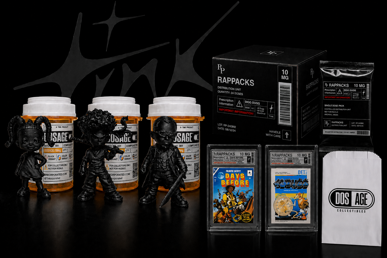
Product Implementation: Dosage
Dosage is a product line within the Tinkorporated system focused on collectible figures. It came from a gap — there aren't many desk collectibles centered on Black characters from popular culture. Dosage was built as a response to that. The first run consists of 10 figures based on recognizable characters drawn from that space. The models were generated using AI tools and then produced as physical objects through 3D printing. Within the system, each figure is treated as a compound. That structure carries through naming, labeling, and packaging. Instead of using standard collectible formats like blister packs or boxed figures, the pieces are housed in prescription-style pill bottles. This ties directly into the Pharmacore direction while also creating something more visually distinct — the bright orange containers function as both packaging and a key part of the identity.
Dosage Figures


Packaging System
The packaging is built around a bottle format with structured label fields: compound number, batch identifier, dosage instructions, and quantity. Variant indicators differentiate release types without breaking the label hierarchy. A QR code replaces the traditional barcode — functional for tracking while maintaining the clinical format. The system is designed for clarity and repeatability across any SKU.


Platform: Distribution Interface
Live Site→The website is not a storefront — it's a system interface. Lab Access gates entry. Patient Profile manages the account layer. Prescription handles checkout. Bulletin controls communication. Every interaction is framed through the system's language rather than standard e-commerce conventions. Built on Next.js with Stripe, deployed via Netlify.


Outcomes
Complete brand, product, and platform system. Functional e-commerce pipeline from product page to fulfillment. Scalable structure that supports new sub-brands and SKUs without identity rework. Defined visual and conceptual language that holds across physical product, packaging, and digital interface.
Next Steps
Expand sub-brands beyond Dosage. Increase product variation within existing compound structure. Refine production pipeline for faster turnaround. Develop campaign assets tied to specific release moments.